To compensate for my terrible mood herein, here’s a bop about being possessed by the ghost of Edgar Allan Poe. I wish I still had a car so I could get in it and badly sing this song at the top of my lungs repeatedly for the 20 minutes it takes me to get to town and again on the return trip.
I’ve done multiple rounds of “nope, let’s not say that here, into the bin you go” and cut this down to the bones, but there may be lingering traces of rantiness. If I wasn’t overdue for proof-of-life, I’d have put off posting until I had something more presentable, but I am, so here we are.
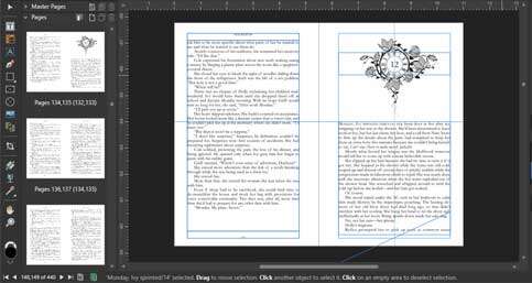
I’ve been learning a new print-book-formatting software. Because I learned the hard way that applying a paragraph style in the software strips the italics from imported text, I’m having to read the text to repair that, as well as correct spots where I disagree with auto-hyphenation’s calculations.[efn_note]Auto-hyphenation is based on numbers I set, but sometimes mathematics and art (book formatting is visual design—an art) come into conflict, and artistry always wins in this house.[/efn_note] And I keep thinking, Damn, I did some good writing. Far from flawless—for instance, there are a thousand places where clarity would have been better served by identifying the character by name rather than pronoun—but nothing I would take issue with if anyone else had written it. And I know I’m comparing a finished, multiply revised, professionally edited product to an unfinished blob and that’s wildly unfair to the blob, but I can’t even imagine ever feeling that good about the blob. It may be external stress putting me in a bad headspace because the future is fucking grim. It may be book fatigue because I’ve been in this book forever with no end in sight and have no faith it ever will be finished. Little of column A, little of column B? Whatever the case, I could use some relief I won’t be getting.
I sure do make visually pretty books, at least.
What was I supposed to be doing? Oh, right. REVISION.
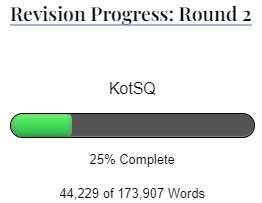 A whole quarter of the way through now! *sobs and shovels ice cream into the void my soul has vacated*
I noticed a mirroring of locales on either side of the act change and thought that observation might make Heroine’s skin crawl in anticipation of reliving not only a stressful first act but all the way back to the pre-story dragon chomping. I may remove the HEY LOOK AT THIS later in favor of subtlety. It’s there already, without changing a word—not exactly, since I didn’t do it with intent, but more like a prediction that lines up closely enough to be eerie. It might be better to leave it be and let readers like me “discover” it for themselves and not beat everybody else over the head with something that’s neat but ultimately meaningless, but I’ll play with the heavy-handed approach in this draft and see what shakes out. It’ll be a few lines laid on like sprigs of rosemary, not melted in like salt. If I pluck ’em off later, nobody will ever know they were there.
Neat, ultimately meaningless, and heavy-handed? Somebody’s four books into a Dark Tower re-read![efn_note]What if Roland IS the Tower? *rips down sheet to reveal densely notated conspiracy theory wall*[/efn_note] [efn_note]Wizard and Glass means quality time with my favorite Manic Pixie Smartass, Cuthbert Allgood, so it always takes the longest to read this one.[/efn_note] [efn_note]Stephen King is a lover of parentheses. Copyeditors and fiction writers who aren’t worth a bazillion dollars are told it’s forbidden to use parentheses in fiction because “we don’t speak or think in parentheticals.” (A similar ban is on semicolons and colons, but I’ve always easily ignored that one.) First of all, I absolutely fucking do speak and think in parentheticals. Asides are life. Barely-moving-my-lips commentary is my stock in trade. I’m not shy with parentheses when blogging or commenting. These footnotes? Parentheticals. (On the editing screen, they’re bracketed by shortcodes, not moved out of line!) And I love me an em dash, which, upon further consideration, I frequently employ as an “acceptable” substitute for the parentheses that rightfully belong around whatever text I’m offsetting from its surroundings. So I’m gonna do it. I will live my punctuation truth, and the flavorless minimalists can choke on this bag of flamin’ hot parentheses, semicolons, colons, short introductory phrase commas, and Oxford commas.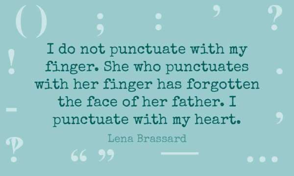 (I possess an unreasonably large number of typefaces, approximately four of which include an interrobang, which I discovered by testing every single typeface upon noticing the one I wanted converted it to a plain question mark. Days later, my brain piped up: “You know, for graphic text, you could have layered an exclamation point and a question mark in any typeface you wanted.” Thanks, Brain. On the ball as usual.)[/efn_note]
I had to look up the term for “the joke drum sound” because reasons. (It’s a “sting,” for future reference.) The traveling theaters are a big deal, of course they have comedy, so of course ba-dum-TISH is a thing that exists in this world.
Next up: The Road Trip Begins
 Fuel an author!